
One of the key elements of branding is finding the balance between getting your message across and overwhelming your audience. After a lot of conversations around branding and number of messages, I thought it helpful to present some tips on how to establish a balance to ensure that your brand doesn’t confuse your audience or limit your message cut through.

One of the elements of what I do every day is to help bring brands to life within a physical environment. I like the challenge of taking a blank template and applying relevant brand elements to bring the actual brand to life in a way that would entice people to shop or to take the required call to action. What I find challenging is when I’m confronted with a very old school theory is that the more logos and messages you use, the easier people are going to recognise and understand you.
In my experience, I firmly believe that this couldn’t be further away from the truth.
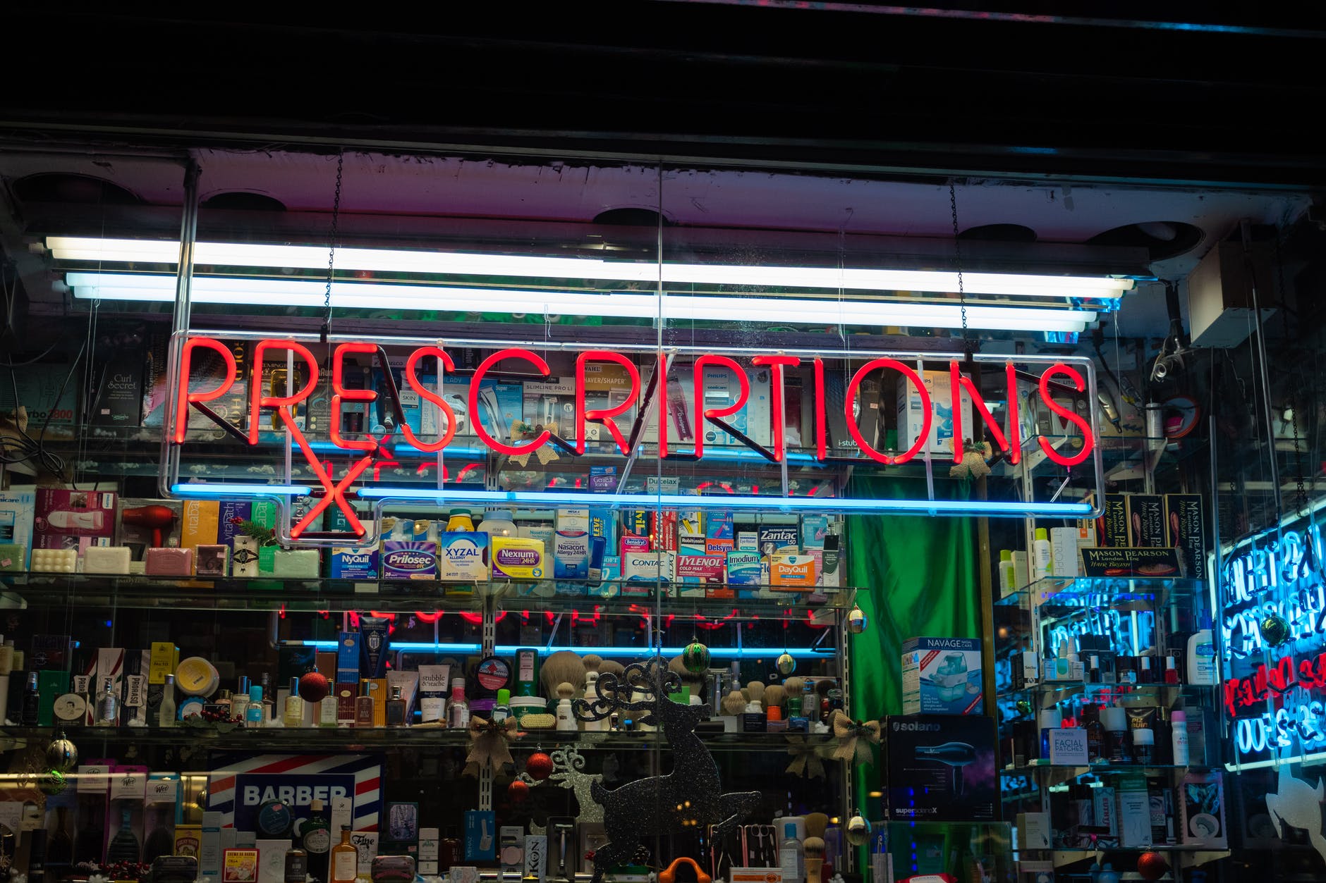
Splashing your brand in every corner is not going to entice people to walk in the store or read your brochure any more than laying down a red carpet and handing out balloons or using scented paper. I go back to the old adage of people being time poor and so bombarded with messages that they need to be able to understand what your saying quickly, otherwise you run the risk of them not understand who you are and what you are trying to offer.
The other aspect of physical branding is that you want people to easily remember your brand, what you offer, your location, consciously or sub-consciously, so that they can either recall it at a later date for their own purpose or to respond to someone else’s need.
So, based on this, what can you do to ensure that your physical brand presence AUTHENTICALLY represents your brand? Here’s just some of the rules that I use when developing physical branding concepts.
Establish mandatory versus primary and secondary elements
When working out what’s important for your brand, look to develop a hierarchy of what needs to be present for your brand all of the time (mandatory) and then as required. Types of elements might include:
Mandatory elements:
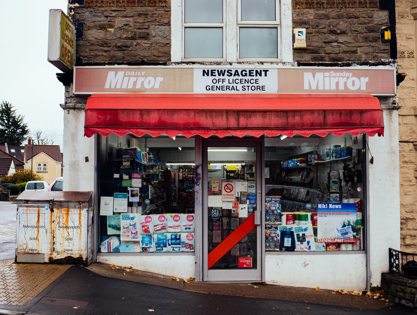
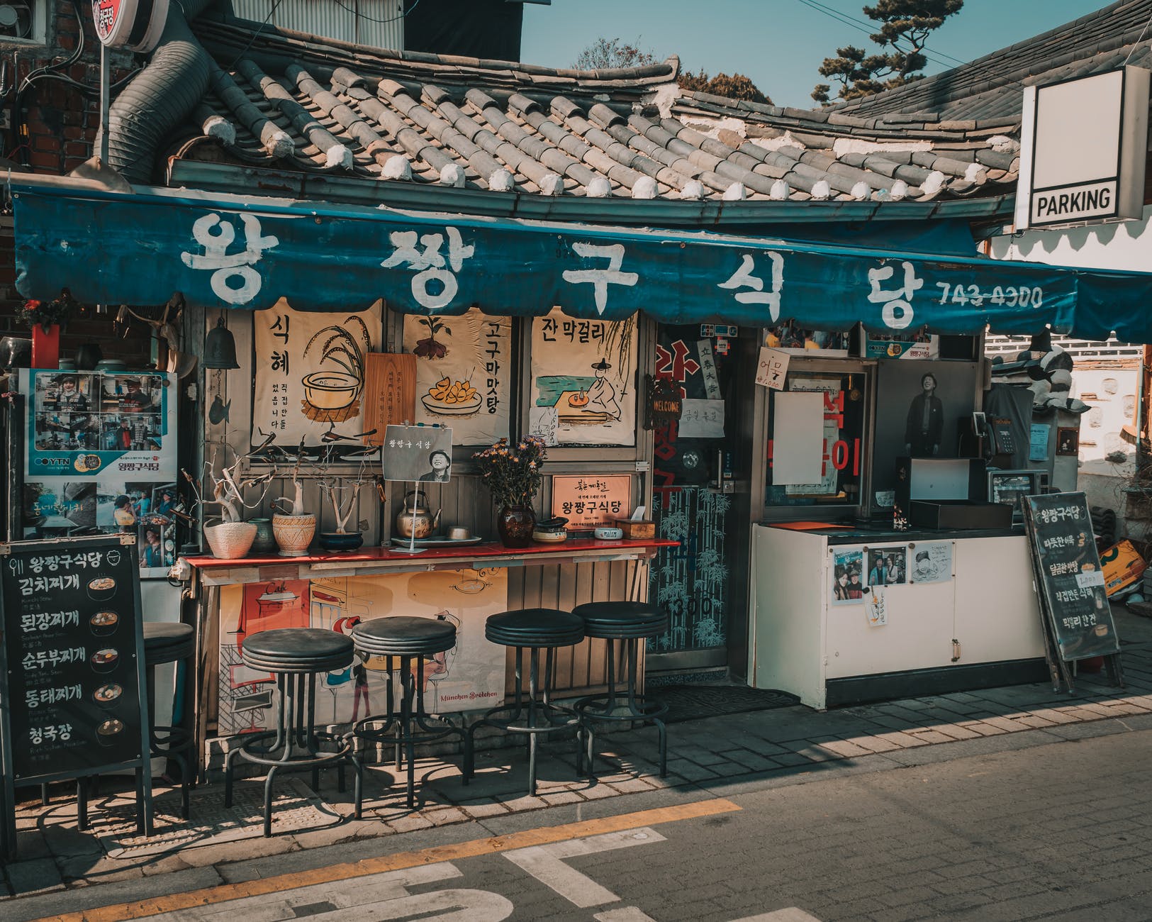
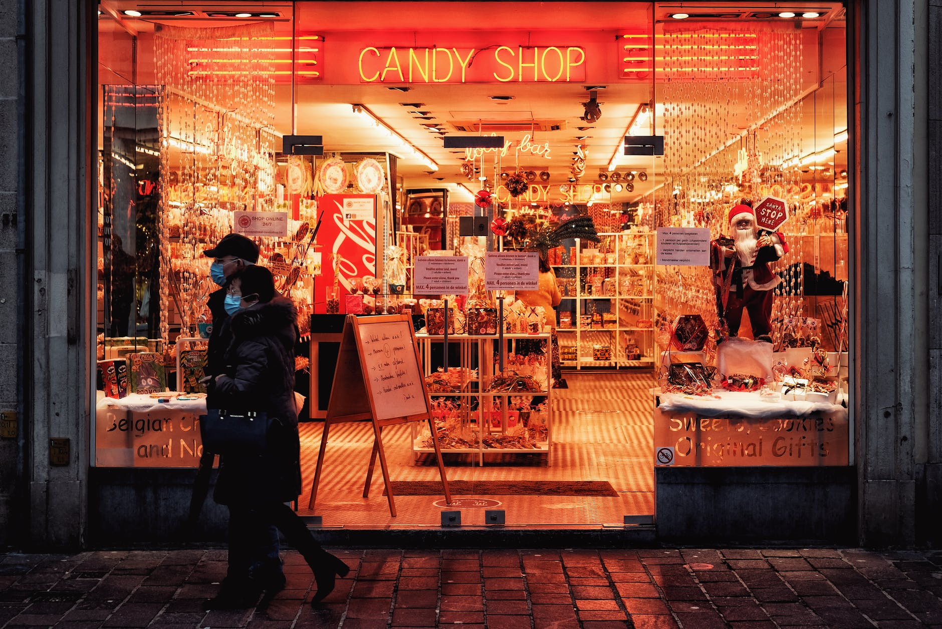
These are elements of your brand that must always be present. In some physical locations such as a building, you might just include your logo. Where your physical location is more portable, such as a vehicle, I’d recommend including your logo, address, phone number and website so that people can easily find you. The reason that I differentiate the 2 is that people can quickly enter your physical premises to contact you whereas a vehicle is out and about so people will need to know where and how to quickly find you. For advertising material, make sure that your brand owns the hierarchy of the messages and is connected to what you are offering.
Primary elements:
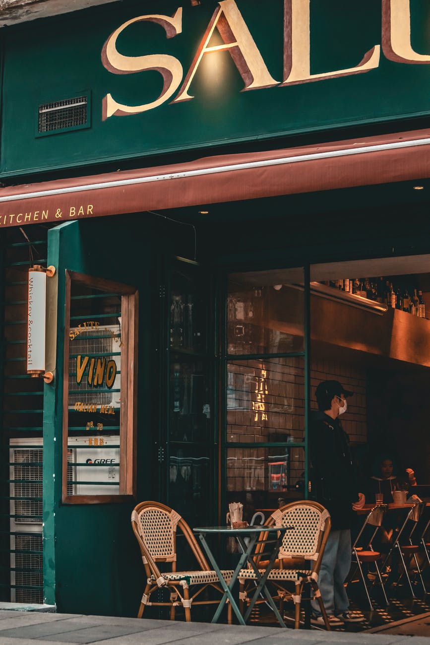
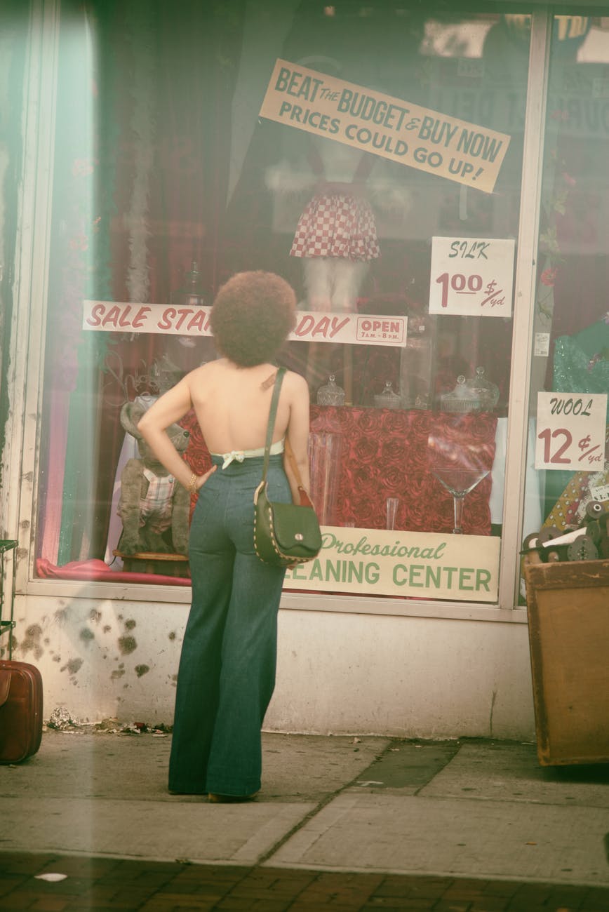
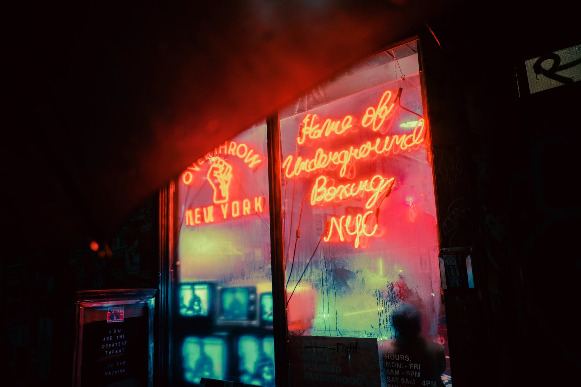
For primary elements, these are the ones that you would look to include should the physical location allow for it. They are the nice to haves but won’t jeopardise your brand if they aren’t present. This might include a brand image, building colour, vehicle wrap, brand statement as examples. These elements could all work together or individually to support your brand and would be applied in a suitable situation. For example, you might use a brand image across the side of a vehicle or store window to help make it look more enticing and on brand as well as on a fact sheet about your business, help to create some interest with the reader.
Secondary elements
These are the lowest level and can be considered as space fillers once you’ve used all of the primary elements.
Create a style guide
Whether you want to be a multi site or have various company places to cover (i.e. office and car), it might be worth creating a style guide. This will ensure that no matter who is involved, professional or alike, your brand is consistently applied across each implementation. The style guide should cover:
– Logo requirements including colour options and any safe / clear space rules
– Brand colours including for logo, backgrounds, fonts, physical paint colours, vehicle wraps etc
– Font type, size and colours
– Brand elements as determined above
Legible Font type & size
All too often I see tiny little messages that do nothing to support the brand. The font type and size that you use should be easily understood and be able to be seen from key locations. If you are on a roadside, make sure that the font type can be seen from people driving past. Take the time to observe where people are going to be seeing the messages from and determined the best option from there. Make sure that your brand messages are not so long that they end up becoming this tiny little print that you need a telescope to see. If you do have long brand messages, I’d consider ways to reduce them for physical branding or not use them in certain scenarios. Remember your legal obligations as well – any fine print must be proportionate to the rest of the advert or offer. Making it too small can be deemed to be misleading as well as causing a negative experience with potential customers.
Correct Placement
Creating physical branding is a waste of time if you place it in a location that can’t be seen. Consider your whole creative, scope out your building, surroundings, where your traffic is coming from or how they are reading it (i.e mobile versus desktop). This will allow you to determine the best location for your mandatory, then primary and secondary elements. Maximise the space that you are using for your primary brand so that it “pops”. Use creative elements such as 3D, well placed lights, background elements, less words to help your brand and primary information pop.
Work with a professional
One of the challenges that I see most commonly is people working with either companies that don’t have the right experience or a different agenda to what would achieve the best outcome. Don’t take the first option that you have – shop around to various professionals and ask what they would recommend. Don’t always go just for price – cheapest isn’t always best especially in this scenario. Look for experience and even identify some other businesses that you aspire or are really fond of the work that they’ve done and find out who did it for them (hoping it’s not all in-house). As with any outsourcing, make sure that you trust and feel comfortable that you are going to get the right outcome. Don’t let them dictate but provide advice – dictating isn’t going to land well when it’s your brand that is at risk!
Now, there is a happy medium of course and I’m not saying that you need to always follow this. Your brand might benefit from doing the opposite to everything I’ve suggested above, so do what makes you comfortable. The only advice that I can say here is remain consistent and just make sure that your brand and brand essence doesn’t get lost along the way. For example, today I drove past a building that had popped up in my area recently. It was painted a very distinctive black colour with 3 letters on the front of the building – so contemporary! Now, those 3 letters might represent the brand but, there was nothing else that allowed me to understand who was located in that building. By the time my eyes wandered around trying to find out anything more about who was there and continued along my way (remember time poor, no time to stop), I’d forgotten the 3 letters so until I wander back to that area, I’m going to continue to have no idea. The same impact can be had in all forms of advertising if you don’t get your brand placement and elements right. All of this can result in wasted money.
Key is – develop your brand and stick to it! As with all marketing your physical presence needs to properly represent who you are and how you want to be represented. And, with all branding, stay true to who you are and make sure you appeal to the audiences that you want to.
Good Luck and take care.
The Marketing Elf
© May 2022
